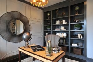
 When styling shelves, we like to keep things clean and simple. We often mirror one side to the other to prevent the design from looking too busy and distracting. In this bookcase, we used white accessories and books to contrast the dark paint. The outside shelves are mirrored and the center accessories provide added interest and lifestyle elements. We are also careful to allow room for the accessories to “breathe” and to not fill the space entirely. The key to styling shelves is to group objects of various shapes and heights to keep the eye interested in what is being displayed.
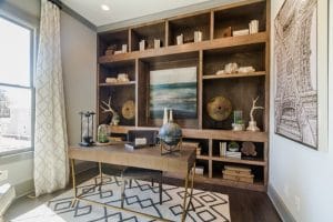
Here is another example of simple styling that is mirrored from one side to the other. In this case, we designed a central opening for a striking piece of art to add a pop of color.


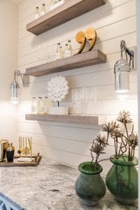
The floating shelves in the bar area of this home are both beautiful and functional. Again, we kept the accessorizing light and airy with glasses and drinks along with a few decorative pieces.
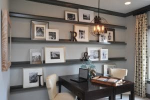
Another option for styling shelves is a photo display wall. Leaning the frames on the shelves with framed pictures in different sizes and styles creates a beautiful and interesting way to showcase family photos. This technique also eliminates the tedious work of measuring and planning a typical gallery wall. Add in a few decorative pieces like letters and symbols as shown and you have a striking shelving display.


Leave a Reply